Jelovnik.
The reference was a menu, so here is one. The numbers carry the page and the dotted leaders do the waiting. It’s set in Montenegrin first, because the letters with marks, like č, ć, š, ž and đ, were drawn with the rest and not added later.
Type anything.
Click the line and write over it. Change the weight, size, ligatures and colour, or pick one of the ready-made lines below.
Everything on the line.
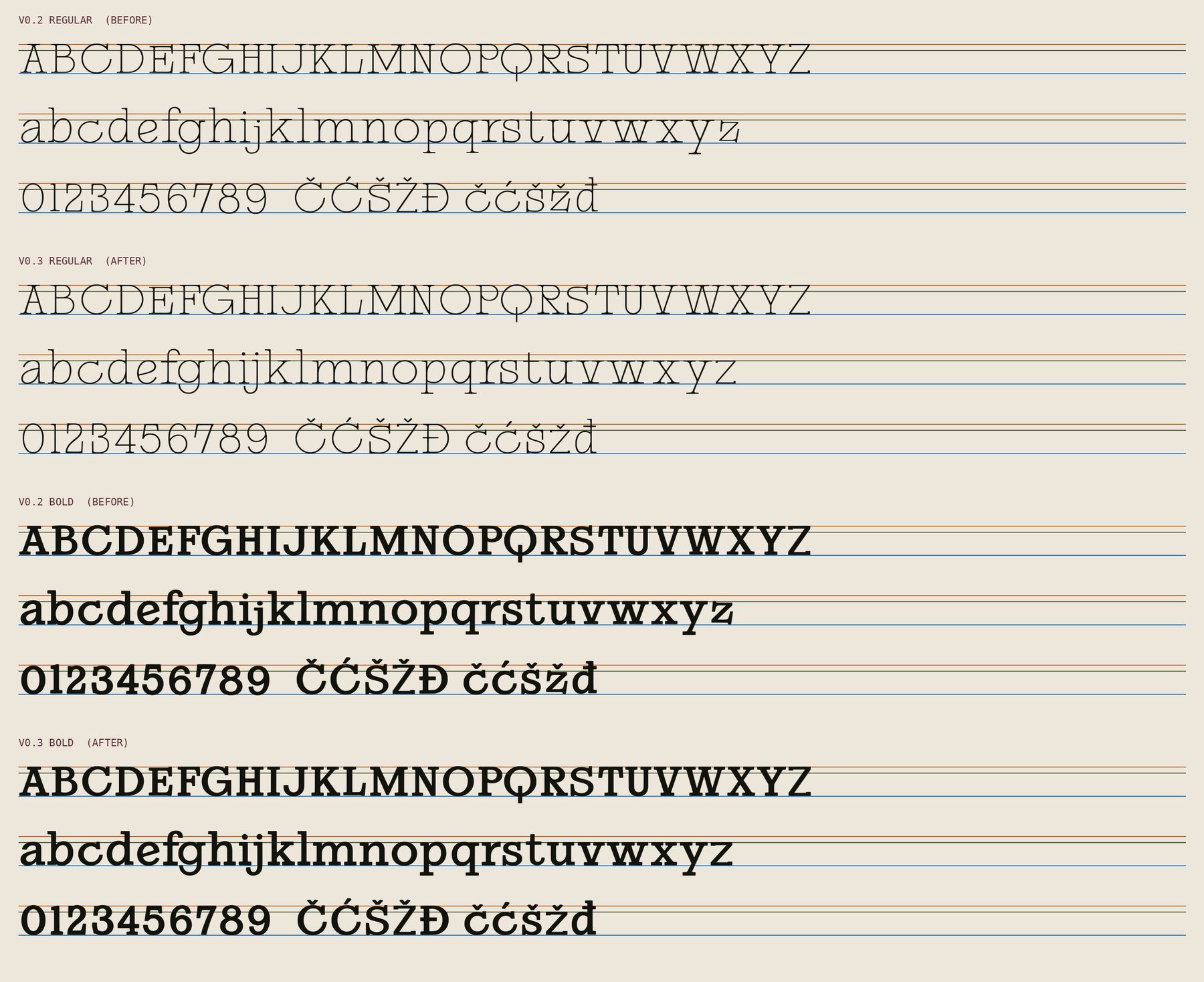
In the earlier drafts some letters stood a little short or floated just off the baseline. Version 0.3 puts every letter on the same five lines, so round letters overshoot by the same hair and the figures stand level. Pick a letter to see where it sits.
What changed: every capital now meets the cap line, so K, L, M, V, W, X and Y no longer stand short. The r and the 1 no longer float. The figures are lining and level. The lowercase z was redrawn from scratch so it stands upright at the same height as x.
Fifteen for text, six for show.
The f ligatures switch on by themselves. The six display ligatures (st, tt, TH, TT, ER and LA) are for headlines, and you turn them on with the discretionary ligatures setting. Tap any pair to see it without.
From the small print to the door.
The same line from 12 to 160 pixels. On the packs, anything smaller than 14 is handed to IBM Plex Mono, which sets the small print.
All 316, both weights.
Basic and extended Latin for English, Montenegrin and most of Europe, with lining figures, currency, punctuation and the degree sign the whole brand depends on. Hover or tap a character to see it large.
- Character
- Degree sign
- Unicode
- U+00B0
Two weights, one voice.
Regular does almost everything. Bold is for the rare moment something has to be said twice.
Olive oil from Žutica olives, pressed in Bar. Massage into damp skin after the last swim, while the sun goes down at 303°.
Olive oil from Žutica olives, pressed in Bar. Massage into damp skin after the last swim, while the sun goes down at 303°.